Friday, 7 April 2017
Wednesday, 5 April 2017
Monday, 3 April 2017

Sunday, 2 April 2017
Friday, 31 March 2017
March Reflection
I am happy with the posts I have completed within my March Plan. I still need to make some improvements to some posts and update my last evaluation question but I am pleased with the outcome after my final month.
Friday, 10 March 2017
Time Management: Evaluation
Despite the amount of time given to complete my Evaluation Questions I am finding it quite difficult to manage my time effectively surrounding them.
Through exploring the evaluation element of my coursework I have discovered that much effort must be put into the questions and their answers. Evaluation is worth around the same amount of marks as my Research and Planning, and I have learned that a lot of research into my own work must be completed in order to answer the questions to the best of my ability.
I am also attempting to make my Evaluations media rich, therefore I am also spending time working on which way of presentation will be most suitable for each question.
I have come to fully appreciate the effort that must be put in to my Evaluation Questions and am working as hard as possible to ensure they are completed within a good amount of time.
Wednesday, 1 March 2017
March Plan
This month solely surrounds evaluating my coursework through 4 investigative questions. I thought that it was a good idea to focus each week on one particular question, which therefore allows me to research and plan a response based around my own work. I feel moderately confident with the evaluation aspect of my coursework as I have experience evaluating my AS Coursework. This month also withhold the final deadline, so I must ensure my blog is fully up to date and of high quality.

Tuesday, 28 February 2017
Final Tasks To Do List
- Rationales
- One more Audience Profile
- Evaluation Questions
- Any post updates
- Upload final Website after improvements
February Reflection
This month I managed to complete my ancillary texts and gain feedback on the whole for all of my products. From here I made all the appropriate improvements and updated my blog with the feedback I was given in order to document the process as much as possible.
I have then uploaded all of my final pieces to my blog. However, I did not manage to get round to completing Evaluation Question 1, so I will ensure that my time in February is spent majorly on these questions.
I have then uploaded all of my final pieces to my blog. However, I did not manage to get round to completing Evaluation Question 1, so I will ensure that my time in February is spent majorly on these questions.
Wednesday, 22 February 2017
Double Page Spread: Final Draft

Following the feedback I received on my first draft, I made several changes to my product in order to improve it's appearance and effectiveness. The first thing that my lecturer commented on was the lack on conventions featured in the double-page spread. One of the main things that I felt was missing, was a drop letter at the beginning of the article. Therefore, I decided to add this and felt like it made my article appear more realistic and professional.
Unfortunately, my lecturer picked up on a few spelling errors, which I immediately fixed and then proofread to ensure they were correct. Lastly, my lecturer suggested adding some photo credits to the image like I had for the front cover on the contents page. I used the colour scheme of the page to place some credits within the top right-hand corner of the image.
After making these improvements, I am now really happy with the appearance of my second draft, and feel like it is now more realistic, professional and effective.
Tuesday, 21 February 2017
Contents Page: Final Draft

Following the feedback I received on my first draft, I made several changes to my product in order to improve it's appearance and effectiveness. The first thing that my lecturer picked up on when reviewing my first draft, was the inconsistency within the main text of the magazine. The use of a more burgundy coloured font for 'Contents' disrupted the flow of the house theme. I agreed that altering this colour to suit the house theme would prove more attractive and effective, creating a more professional feel. Therefore, I made this change to the font. I also altered the box of the cover credits to fit with this change.
The other suggestion that my lecturer made, was to highlight the articles within the contents that appeared on the cover. I felt that this was a great idea, as if the audience wanted to look immediately at an article they viewed on the cover, they would be able to see it highlighted in a different colour.I chose to use red, as it was a colour included in my chosen colour scheme and also linked in nicely with the colour theme of the images used.
After responding to and acting on the feedback I receive on my first draft, I am now happy with the appearance of my contents page. I feel like the improvements have cause it to appear more attractive, consistent and professional.
Monday, 20 February 2017

Front Cover: Final Draft

Following the feedback I received on my first draft, I made several changes to my product in order to improve it's appearance and effectiveness. The first thing I changed was the cover lines of my front cover. My media lecturer suggested altering them to make them stand out further. To do this I used a technique I had used in my previous media work, which involved changing some of the more important words, increasing the font size and choosing a bolder font in order to attract the audience's best interest to those words, which will them cause them to look further into the cover lines. I have ensured that the fonts fully contrast by choosing one serif and another sans serif font. This means one in straighter and therefore bolder.
Unfortunately, there were some accidental spelling errors that need amending. I made these alterations to spelling whilst making the changes that my lecturer suggested.
One of the main things that concerned me about my lecturers comments was the way in which the model's arm appeared to fade into the background on the left third of the front cover. To change this I used the shading and blending tool on photoshop to darken the area around her arm slightly. This prevented the model from fading into the background, and also made her stand out more. I ensured that despite the use of these tools, the image still appeared realistic.
By making these changes, I am now really pleased with my front cover, and believe it appears attractive and effective.
Friday, 10 February 2017
Website: First Draft
http://oliviajayne335.wixsite.com/artistamag
Main Page: Home
Hyperlinked Page 1: Magazine
Hyperlinked Page 2: Creating the Desired and Dramatic Smoky Eye Article
Main Page: Home
Hyperlinked Page 1: Magazine
Hyperlinked Page 2: Creating the Desired and Dramatic Smoky Eye Article
Friday, 3 February 2017

Wednesday, 1 February 2017
February Plan
This month I plan on creating and uploading my first ancillary text drafts. After this I plan on getting feedback on all of my first drafts in order to make any improvements that are required to ensure that my products are realistic and professional. Then, hopefully I will move forward into evaluating my work.

Tuesday, 31 January 2017
January Reflection
By using my time to fully dedicate my coursework time to completing my first drafts of each product, I have found that I was able to manage my time around my planned tasks correctly, therefore allowing me to create professional and successful first drafts.
I am really pleased with how time effective I have been and am looking forward to showing my lecturer my first drafts and hearing his suggestions on how to make them better!
Friday, 27 January 2017
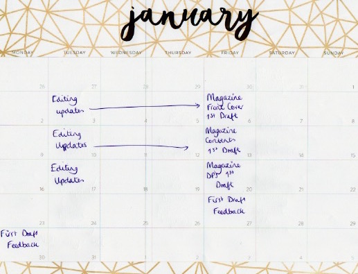
First Draft Feedback
To gain feedback on my first drafts, I printed out my products and handed them into my media lecturer. From here, he analysed my products and talked through his comments with me, suggesting improvements and what he found effective. From this, I will make changes in order to improve the design of my magazine in order to make it more professional.
Front Cover Improvements:
- Make change to the cover lines, in order to make them stand out further, rather than just sit as blocks of text
- Spelling errors
- Cause the model to stand out more, as she currently appears to fade into the background on the left arm

 Contents Page Improvements:
- Change prominent colours to suit colour scheme more, for example, 'Contents'
- Potentially highlight stories that are on the cover
 Double Page Spread Improvements:
- Use more conventions, for example, a drop letter or kicker of text
- Spelling errors
- Photo credit?
Friday, 20 January 2017

Friday, 13 January 2017

Friday, 6 January 2017


Wednesday, 4 January 2017
Editing My Chosen Images
In order to document the progression from choosing my images, to creating an image suitable for my final products, I used photoshop to edit and adjust my pictures. I felt that this program would allow me to create a more professional and high quality product.
To document the editing process, I have used Quicktime Player to record my MacBook screen. From here I edited this video with iMovie to add some music and create a title to the video.
Within editing this particular image, I majorly used the brush and mixer brush tools. These allowed me to smooth out any imperfections within my images. I also used effects and adjustment layers in order to create a more sombre tone to the image. I also created a vignette effect to my image through these adjustment layers surrounding the model.
I am pleased with the outcome of this image, and plan on using similar techniques within my other magazine images and billboard.
Monday, 2 January 2017
Double-Page Spread Article Draft
Creating the Desired and Dramatic Smoky-Eye.
How to create that sultry, seductive look using only MAC Cosmetics products.
For as long as I can remember, I have admired the infamous brand that is MAC Cosmetics. Over recent years the company has expanded and grown to be a statement within Newcastle's Make-Up community. With several counters distributed over the region, us northerners would go crackers to grab every lipstick shade possible! Collabs with the likes of Mariah Carey, Miley Cyrus and even Disney hit Cinderella, it's easy to decipher MAC's rise to success.
If you choose to visit any MAC counter in the region, you will no doubt meet some of the most finely painted faces in the North East. When I recently visited, I spoke to several of the artists in store, who I questioned about this season's musts in the industry, and all suggestions pointed to one thing; the smoky-eye. The smoky-eye is a recurring trend that arises almost every fall/winter, and it is a statement look for those wanting to make an impact.
If you're daring enough to create a smoky-eye within your look, the you will require technique and a strong arm for all that blending you're about to do! Today, I'm gonna simplify it down, just for you, and show you how to succeed in achieving your smoky-eye. And...to make your life even easier, I'm using just MAC Cosmetics products, all available at any north-east counter!
1.) Prepare the skin using Natural Radiance Prep+Prime (£29.50) to balance uneven skin tone, and create a layer between your skin and your foundation. Next, apply Studio Fix Fluid (£22) for a full coverage, matte finish, guaranteed to focus all attention onto your eye-look.
2.) Using Pro Longwear Paint Pot (£16) in a shade that matches your particular skin tone, prime the eyelid, setting with a neutral shadow to prevent creasing. I've chosen to use Amber Times Nine Eyeshadow Palette (£25) in this particular look, but you can customise your shadows to suit the tone and colour smoky-eye you desire.
3.) I firstly used a 217 Brush (£20)to blend the shade Cozy Grey into the crease, creating a transition shade to help your shadows blend together. From here, I used Cork to darken the crease, blending this out to build the initial smokes. Using a 228 Brush (£16.50) , I placed Aromatic quite harshly into the crease, smoking it out with my 217. To add that dark dramatic look, I placed the palette's darkest shade, Pepper Please all over my lid with my fingertip. This maintained the pigment and added a slight shimmer to my smoky-eye
4.) Using Brow Sculpt (£16), create a harsh, dark brow by using pressured strokes, so that the brows balance out your dramatic eye-look. Using, Pro Longer Concealer (£18), cover any potential blemishes or redness on the face, whilst also targeting any fall-out from the shadows, in order to ensure a clean look. Set this with Studio Fix Perfecting Powder (£21).
5.) Use Peaches Powder Blush (£18.50) to create a subtle warmth to the skin, and apply Refined Gold Bronzing Powder (£22) in the hollow of the cheekbones to create dimension in the face and allow your cheek bones to pop.
6.) To ensure all eyes are on the eyes, take Oak Lip Pencil (£10) to outline the lip, and use Peachstock Lipstick (£15) to create the ultimate nude lip! Finally, add some of the famous Soft and Gentle Mineralize Skinfinish (£24) to add that desire glow and voila! You did it!
Sunday, 1 January 2017
January Plan
January will be solely based around the creation of my magazine as I feel like I need a larger amount of time to create and edit a product that appears realistic and professional. I plan on posting transition pictures as well as the first drafts of each page.
Subscribe to:
Comments (Atom)