Like November, I decided to use my free Wednesdays to complete blog posts, however due to the Christmas period, a lot of these Wednesdays were filled with work shifts and I did not have as much free time as I originally planned.
I still managed to complete the majority of posts that I planned throughout the Christmas holidays and am feeling prepare for my return to college.
Saturday, 31 December 2016
Wednesday, 28 December 2016
Monday, 26 December 2016
Friday, 23 December 2016
Deconstructions Summary
I completed the deconstruction of various examples of the products I planned on creating. Last year, in my AS Coursework I only created a magazine and did not need to complete research or create ancillary tasks. When I deconstructed magazines in my AS Coursework I chose 3 covers, 3 contents and 3 DPS. However, because I had to deconstruct websites and billboard, I decided to take this number down to 2 of each. I felt that this was a more manageable amount for the workload that I had.
I found that deconstructing these products allowed my ideas to develop surrounding conventions, tools and connotations. Studying these products also gave me an idea of what I found worked and what I liked about that particular product. This gave me a good basis to begin my products, emulating these techniques and styles.
I found that deconstructing these products allowed my ideas to develop surrounding conventions, tools and connotations. Studying these products also gave me an idea of what I found worked and what I liked about that particular product. This gave me a good basis to begin my products, emulating these techniques and styles.
Thursday, 22 December 2016
Magazine App
 It is considerably popular within the magazine industry to maintain an app compatible with smartphones, allowing readers even easier access from a device which they always carry with them.
I felt that this was a perfect idea for my magazine as my audience are generally smartphone and social media users, as found in my reader profile research.
I have created 2 example apps on iPhone and iPad.
I felt that creating these apps exercised my photoshop skills even further and allowed me to delve into further possibilities of my magazine.
Wednesday, 21 December 2016

Monday, 19 December 2016
A Change of Font
Upon researching my magazine, myself and my target audience selected a font that most suited my magazine and it's genre. Due to my target audience favouring the font, I believe it was the ideal choice. However, when placing the font into my front cover, it does not fit as well as I had hoped.
The font looks out of place and does not agree with my image and magazine genre, taking the softness away from my chosen image. Therefore, I experimented with both new and old fonts that I came across. After browsing many, I came across a new font, which I particularly liked. I will paste the differences in these fonts below.
Old Font:

New Font:

When placing in the new font, I felt much better about the appearance on my front cover and felt positive enough to move forward with this font.
Friday, 16 December 2016
Contact Sheet Creation
In order to place all of the images I took at the shoot together, I created a contact sheet on photoshop, by selecting File > Automate > Contact Sheet ||. This would allow me to compare all the images together in one place and determine which ones I liked best, which ones added variation to the images I am using, and which suited my genre and target audience.
I then went on to circle in red the images I decided were the best for my magazine and circled them in red, by creating a new layer over the contact sheets. I will paste below the contacts sheets once circled:


From this, I am taking the images and editing them one by one so that they follow my color scheme. I will post an update of how these images turn out. I will also embed those images into that post.
From the photos I have selected, I have also taken two example images, one that I like and have chosen to use, and one that I dislike and have chosen against using. I think it is important that I fully develop my ideas and explore which images are suitable and why.
Image I like:
 I really like this image of my model, as she is directly addressing the audience, creating an inclusive feel and drawing them in to the magazine. The lighting of the pic is good and her make up is visible in a positive light. The image connotes strength and confidence, which is how I'd like my audience to feel form my magazine in terms of their make up. If they feel like they will be able to gain her strength and confidence then they will be encouraged to by the magazine.
Image I don't like:

This image is not suitable for my magazine due to it's lack of good lighting and dark shadows. The model is not visible and her make up cannot me seen. The model is also facing away from the camera, creating no positive connotations. Therefore, I will not be using this image in my products.
Wednesday, 14 December 2016
Potential Competition
In order to explore magazine similar to my own, I have researched regional magazines that share characteristics with my product. Therefore, I will be able to compete in the magazine industry with these products, improving the success of my product.


Monday, 12 December 2016
Billboard Recreation


In order to gain further understanding of the conventions and creation of a billboard, I decided to take an example of a magazine billboard, and recreate it within Adobe Photoshop. I believe Photoshop would be the perfect program to use due to my future use of it when creating my final product. I found the billboard quite challenging to create, due to it's several layers and overlapping images, however I found that several dominant tools helped me achieve this particularly similar recreation.
Firstly, I found that one of the most useful tools that I used was the text tool. The tool became useful through the website link, tagline and various elements of the magazine within the smartphones and tablet screens. Through the various fonts available on Photoshop, I was able to find a font that mimicked the original font from the billboard. I will definitely be using the text tool within my final product.
The use of rasterizing layers, the magic wand tool and colour overlay all worked together to create the accurate masthead/logo on the billboard in order to maintain this brand identity. To find 'The Resident,' I searched the internet for the magazine and found the logo. However, the text was black and to create a copy of the billboard, I'd prefer it to be white. Therefore, I saves this image and cropped it down to the logo. From there, I rasterized the layer and used the magic wand tool to expel the area around the text that I did not require. Then, I was left with the logo. I edited the layer's properties in order to select white colour overlay. This changed the text to white. I then added some shadowing to create a more 3D look. I believe that I was these tools when create my own billboard and magazine. This is due to my chosen font being taken from dafont.com. I will be required to use the magic want tool on the screenshot of my logo from dafont.com. I may also choose to shadow my masthead/logo in order to make it stand out.
I also made use of the magic wand tool to edit an image of my friend to copy the magazine used within the billboard. I was certain that I wanted to use my own images, as I will be using my own images within my final product. I also believe that simply using the same image would be making the task easier for myself, and by challenging myself with my own images, I found that I developed and improved my skills further. I then edited the image of my friend on to a similar background to the original image and used the text tool to create a similar look. I searched the internet for images of iPhones and iPads to create new images with my magazine cover on the screens. I then used 'embed image' to place these images onto the billboard, shifting their position and size to mimic the original image.
The use of the App Store logo from a screenshot, placing it in a directly similar way. The use of the shape tool created the orange box, adding to the brand identity and creating and eye-catching element. To employ a similar shade of orange, I used the eyedropper tool as this allowed me to find the exact same colour.
Overall, I am considerably pleased with the outcome of my billboard and, therefore, am encouraged when it comes to my final product. I believe my enhanced skills will allow me to create a professional and successful final product.
December Update
Like November, I planned on using my free time on Wednesdays to complete a wider amount of posts, however I have not completed as many posts as I had planned.
Due to the extremely busy festive period within retail, I have been given shift on these Wednesdays and have therefore not been able to use this time.
However, I am planning on using the Christmas holidays to complete and update anything that I didn't manage to complete.
Due to the extremely busy festive period within retail, I have been given shift on these Wednesdays and have therefore not been able to use this time.
However, I am planning on using the Christmas holidays to complete and update anything that I didn't manage to complete.
Friday, 9 December 2016
Magazine Recreation


In order to improve my Photoshop skills, I decided to recreate an example regional magazine. I chose Suffolk magazine as I found it to maintain many generic conventions of a magazine, allowing me to exercise my ability to use these conventions, therefore improving my ability to create a professional magazine when it comes to my final product.
I decided to use my own images within the recreation, as I believe it would challenge me, rather than using the exact same image, which would simplify the process. The use of this challenge allowed me to improve my skills further, and mimicked the way I would create my final product with my own images. The only image I used from the internet was the pumpkins as I was unable to take my own similar image.
I decided to stick with the theme of animals in nature in my recreation, therefore I used an image of my own dog at the beach. Like the animal in the picture, I placed my own animal centre, covering at least two-thirds of the front cover. I use the text tool, predominantly, in order to copy the text from the original magazine. When creating the text, it was mainly white, however, I used the eye dropper tool when adding the yellow features, to attempt to keep the colours and magazines as similar as possible.
I thought that the use of tagline above the masthead looked considerably effective, so would consider using this in my final product. I also really liked the way the website was pasted above the masthead, as the audience will be able to see it when they observe the front cover. I believe I will use this technique as I will be creating a website alongside my magazine that I would like my audience to view.
I made use of the magic wand tool when editing my images of my lower left-hand model and the pumpkins, I rasterized both image layers and used the magic wand tool to expel the area around the image that I did not require. I then pasted both images of a similar size in a similar position in order to copy the original magazine. I selected similar fonts within the bottom of the magazine. I then took an image of a barcode, and copied the price within a similar font to replicate the original.
One thing I believe I could've improved was the white text against the white fur in my recreation. Evidently this was not a problem with the original, as the colour tones in the image were ultimately different, however, within my magazine this made the text difficult to read. I know for future reference not to overlap similar colours as this prevents the image from being as eye-catching and makes the text difficult to read.
Conclusively, I am particularly happy with the outcome of my magazine recreation and believe it has made me more skilled and confident for when it comes to creating m final product.
Wednesday, 7 December 2016

Monday, 5 December 2016
Pitch Feedback
In order to gain the opinion of my target audience, I have printed several copies of my pitch and distributed it to members of my target audience. I asked them to comment any questions, opinions or suggestions around the pitch in order for me to improve and amend my pitch. I have scanned the feedback I received and, from here, I will improve my pitch in order to produce a more suited magazine.
Feedback 1:


From this feedback, I have been informed that the art that I am included must be specified to my audience. I will be making a magazine based around make up artistry with Newcastle. I will show the gender neutral element throughout the magazine through non-gender specific references, for example, I will not use phrases such as , 'a must-have for any girl.' Furthermore, the feedback questions how I will gain the resources and knowledge to produce a high quality product. I will research into several elements of regional magazines, for example, similar products, inspirational products, the software I will use etc.
Feedback 1:

It is evident that this member of my target audience enjoys The Crack magazine. This is a positive, as it ensures that people of my chosen region have a confirmed interest in art. However, this also informs me that I need to set my magazine aside from this and drive it forward in order to compete with The Crack. This person questioned, 'could males be interested?' I believe that predominantly, my audience will be female. However, it is notable that gender neutrality and male interest is dominating the make up industry, therefore this is the perfect time for my magazine to identify this and encourage it further. This means not only does my magazine inform and entertain but it also communicates that my magazine supports gender equality and believes that make up should not be gender specific. The feedback also suggests taking research from make up magazines. I believe that this is a brilliant idea. Therefore, in a further blog post, I will research make up magazine as a whole, and what makes them successful.
Feedback 2:

Friday, 2 December 2016
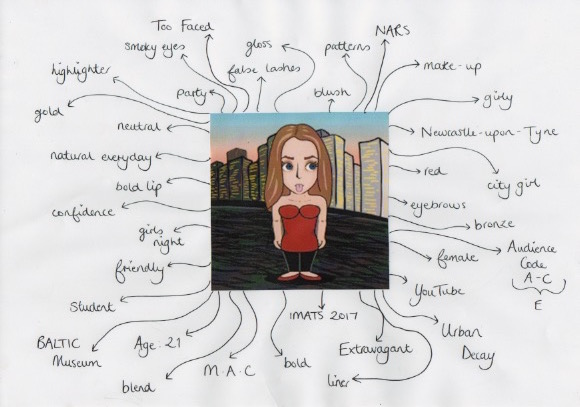
Character Drawings
In order to gain a better perspective of my target audience, I created two character drawings of a male and a female individual. I created two avatars to represent these example audience members and used word association to create a mindmap. These words describe my target audience, identified their interests and their preferred make-up features. I have scanned these mindmaps into my laptop and posted them below.
Audience Profile 1: Male, 28, Newcastle

Audience Profile 2: Female, 21, Newcastle
Thursday, 1 December 2016
December Plan
Within December I am planning on using my free Wednesday to complete the final areas of my research and planning. I am going to be exploring each area/label and commenting on how all of my research came together in order to shape the way I am going to create my products.

Subscribe to:
Posts (Atom)